︎︎︎ GO BACK
Svenska Djurambulansen

BACKGROUND
During the advertising competition 48H, Svenska Djurambulansen (eng: The Swedish Animal Ambulance) was the client of the year, who would become the client for all participants. The assignment for us was to produce a print advertisement parallel to a digital ad, which would work as a ”sibling idea” to the main print advertisement.
PRINT
From our justification to the jury;
How do we show that there is an ambulance for animals? And how do we tell that the ambulance exists thanks to monthly donors and donations? These questions formed the basis for our ad idea.
We want to start the viewer’s brain with strong communication. A headline that gives such ambiguity that the reader has to think. It’s so logical to call 911 in an emergency, but think again. Who do you call when your pet needs urgent care and your car is at the repair shop?
So how do we reach through the noise? Everything is carefully selected. The design should influence the recipient, but not steal attention from the message. A small dog with a big attitude. A dog that talks to the viewer through look and expression. Let the image and headline show the most important message and keep other disturbing elements down. The paradox of a small dog and a cocky tagline becomes a contrast in the message.
The copy should pick up all the important things that are not said at the beginning of the ad. It is short but informative. The effect is next to the logo. The telephone number for the Swedish Animal Ambulance. It coincides with the fact that the owner did not call 112. Our bottom line is more straightforward. It shows how the viewer becomes a monthly donor or contributor. The QR code makes it easy for everyone to become one.

DIGITAL AD
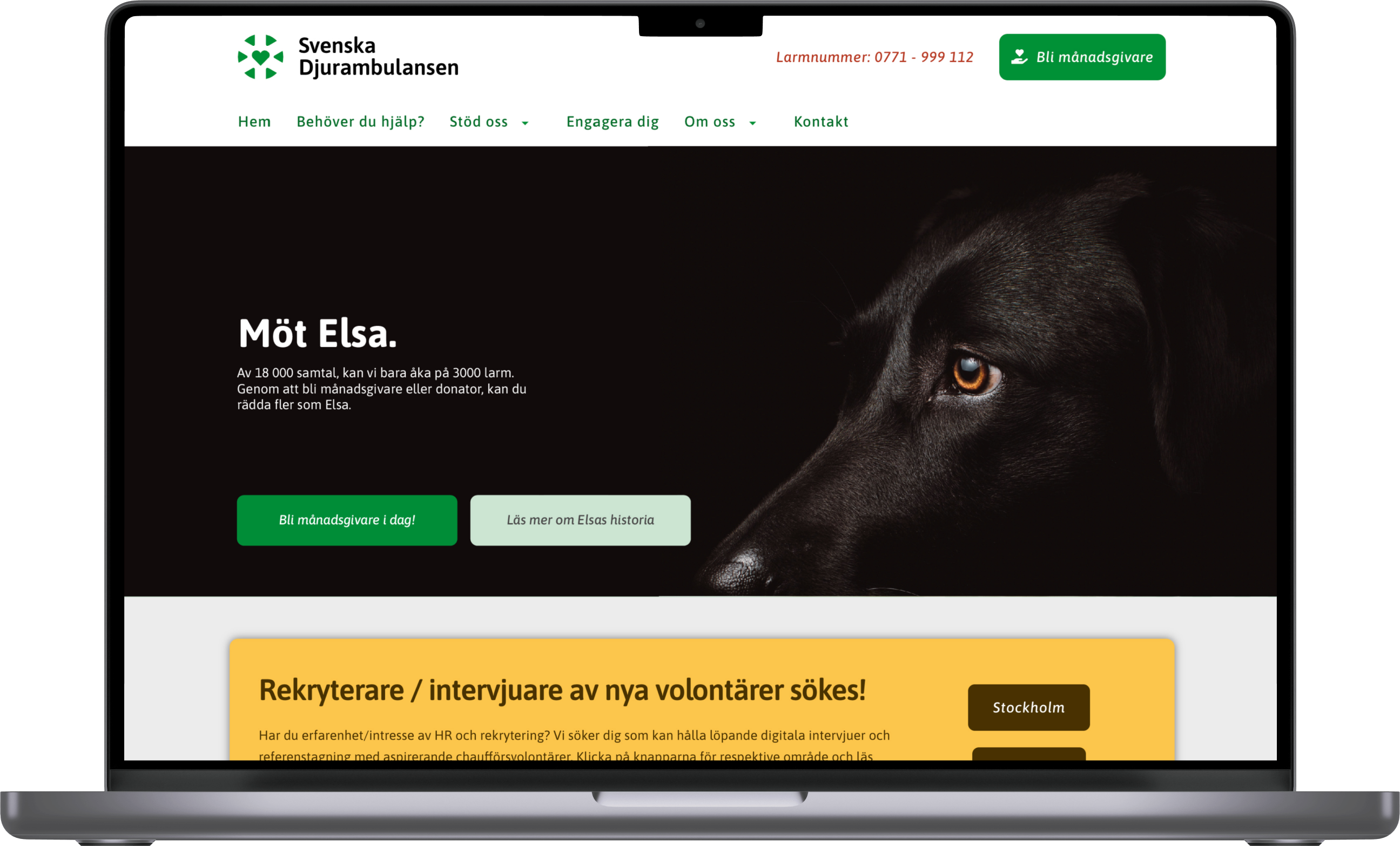
Through the print advertisement, the visitor is attracted to the website, where they are met by the continuation. The continuation is based on storytelling around the animals, and a kind of testimonial idea where the visitor gets to look the survivors in the eyes and hear their story of how they were helped. All thanks to the great work done by the Swedish Animal Ambulance. As a punchline in the concept, we then want to highlight and inform the visitor that through monthly donors and donations, the Swedish Animal Ambulance can continue to save more people like the dog Elsa.